Web design · development · redevelopmentStrategy before decoration
Case study

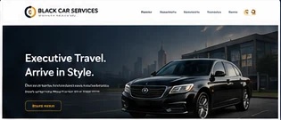
Black Car Services: a quieter premium website for executive transportation.

The project called for a distinct identity from traditional limousine websites, with a cleaner presentation for private car, airport and chauffeur-oriented searches.

Case studiesAll ProjectsDestiny LimousineMy Limo RideBlack Car Services
Black Car Services website project preview

The challenge

Premium transportation websites can easily become visually heavy: dark backgrounds, oversized vehicle imagery, repeated luxury claims and too many competing calls to action. Black Car Services needed a more controlled hierarchy that could communicate professionalism without relying on decoration alone.

Service-led structure

The information architecture separates airport black car service, chauffeur needs, private transfers and related travel intent so visitors can reach relevant information quickly. Page copy focuses on the trip, service expectations and vehicle choice rather than generic luxury language.

Visual restraint

Typography, spacing, contrast and consistent components do more of the design work. That gives the site a premium feel while keeping pages fast, readable and adaptable across desktop and mobile screens.

Search and conversion balance

High-intent phrases are integrated into headings and supporting content where they belong, while calls to action remain visible without dominating every section. The result is a site that can serve both search discovery and direct visitors.

What this demonstrates

Premium design does not require visual noise.

Hierarchy creates confidence

Visitors should know what the company does before they encounter secondary services or supporting details.

Restraint improves usability

Fewer competing treatments allow typography, spacing and meaningful content to carry the experience.

Performance is part of design

A polished interface loses value if mobile users wait for oversized assets or unnecessary scripts.

Premium positioning

The design avoids the visual clutter common in some luxury-transportation sites. A restrained palette, clear type scale and more space allow the service information to carry the brand.

Service separation

Black car, chauffeur, airport and destination needs overlap, but they are not identical. The structure allows each important intent to receive its own explanation.

Mobile discipline

The interface was designed so navigation, calls to action and long-form service content remain usable on smaller screens without relying on oversized imagery.

Search language

Commercial phrases are used where they accurately describe the service, while supporting copy focuses on vehicle fit, trip type and practical decision-making rather than repetitive keyword patterns.

Key lesson from the project

Premium design often improves when there is less competing for attention. Strong hierarchy, accurate information and consistent components can communicate quality more effectively than constant luxury claims.

Planning a serious website project?

Discuss Your Website